
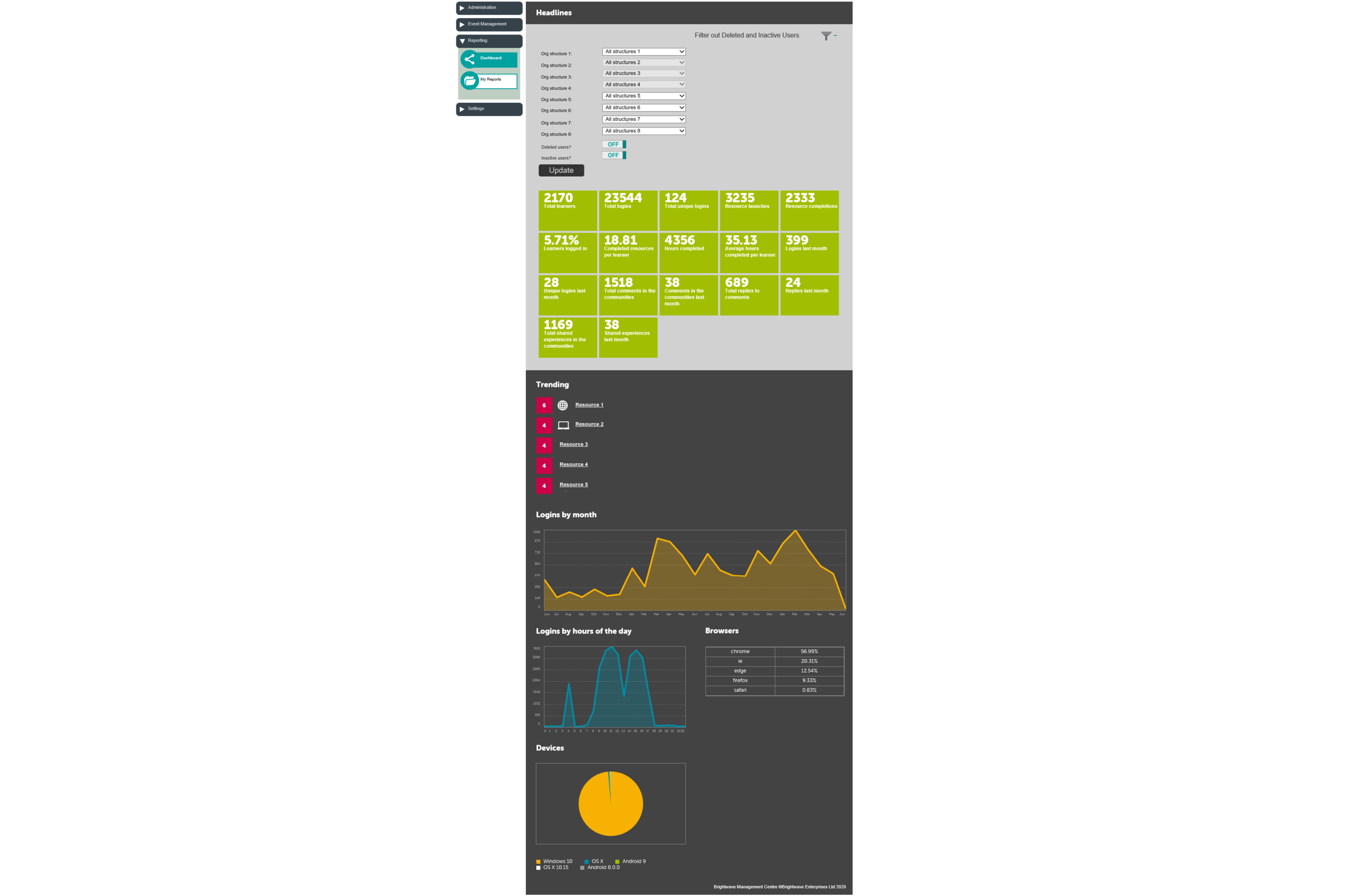
The dashboard for our administration system had been around for over 10 years, and although it was fit for purpose in the beginning the product and clients had moved on and the needs had changed. Administrators were struggling to find the information they needed for Key Performance Indicators (KPIs) quickly and efficiently, so an overhaul was needed.

The code base for the admin site is very old, and there were no plans to make any big changes to that, so the design changed were mostly restricted to adding and removing content, and small tweaks. A perfect scenario for some simple card sorting!
I got a few of our main clients involved and set about working out what content was still relevant and what was not, and what were the priorities.
The people involved were spread out across the country and so I used Miro, an online collaborative whiteboard platform, and made all the individual sections of the existing dashboard into sticky notes that could be moved around.
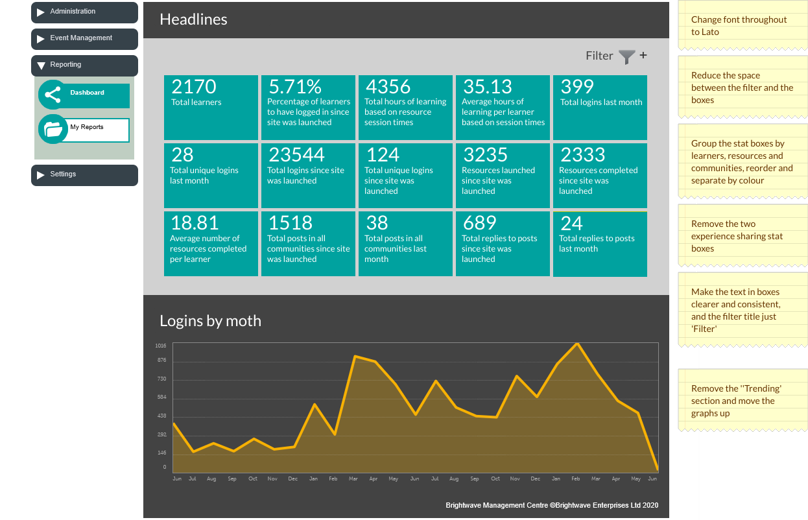
I asked each user individually to go through the process of sorting the notes into groups, prioritising the groups and their contents, and to explain to me what each grouping was to them, and then recorded each result.
Once all users had carried this out I compared the results to see how each grouping fitted, and from this I could see how I needed to group things in the final designs, including which sections parts were no longer relevant. It also allowed me to order the layout to have the most relevant information at the top of the dashboard.
They update has significantly decreased the time overheads for the administrators to find the information they need.